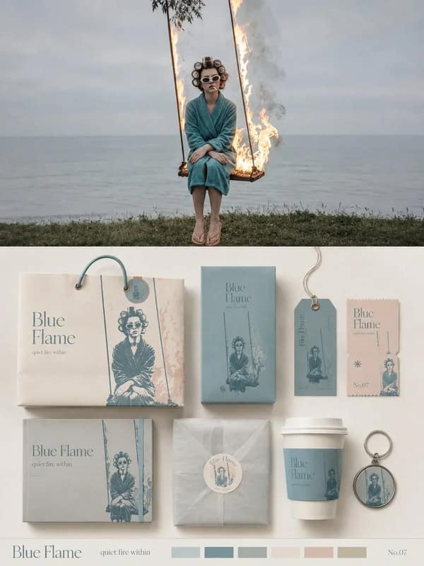
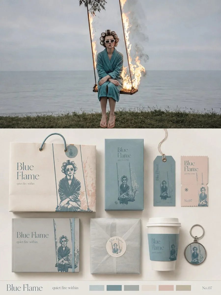
Please turn each photo I upload into an independent, high-end design poster—no multi-image collages; each photo is output separately. Use a 3:4 vertical composition overall, with the upper and lower areas strictly divided 1:1, each occupying 50% of the frame.
The upper half retains the original photo, preserving the subject's identity, structure, posture, realistic texture, natural lighting, and original color atmosphere. Only apply subtle, high-end photographic color grading to achieve an artistic magazine, independent publication, and exhibition photography quality. To fit the format, naturally extend the sky, ground, or environmental background, but do not stretch, distort, or alter the subject.
The lower half extracts the most recognizable subject, silhouette, posture, and narrative relationships from the photo, transforming them into a complete brand packaging and collateral visual system. Do not simply replicate the photo; instead, distill the subject's characteristics into reusable core graphics, illustration symbols, patterns, color blocks, or identifying elements. Then apply these to different sizes and uses of packaging carriers, ensuring all materials belong to the same visual family.
Based on the original image's theme, automatically select the most suitable 5–8 carriers, such as paper bags, boxes, gift sets, labels, hang tags, tickets, cards, stickers, sleeves, cup packaging, keychains, wrapping paper, or other related materials—do not force fixed categories. Use 1–2 main packages as the visual focal point, with the remaining materials arranged in modular combinations by size, aspect ratio, and function. Organize the composition with clear grids, edge alignment, scale contrast, spacing rhythm, and generous white space, like a professional brand design studio's packaging identity presentation board, not a product display or cluttered mockup collage.
The color palette should be soft, airy, and slightly desaturated high-end tones, primarily light powder blue, misty blue, sky blue, and cool airy blues, paired with ivory white, cream white, light beige, soft gray-green, and architectural neutrals. Use only small amounts of dusty rose or muted blush as visual accents. Different packages can vary the color area and combination, but must maintain the same color system to create a rich yet unified series feel.
Materials emphasize realistic, refined paper and packaging craftsmanship. Can feature matte paper, textured paper, thick cardstock, translucent paper, embossing, die-cutting, folding, stickers, spot printing, and subtle layering. Lighting should be soft and natural, used only to show paper thickness, creases, and material differences—avoid plastic feel, strong reflections, exaggerated 3D, and cheap product rendering.
Text is also designed as an integral part of the entire packaging system. Extract a short English main title from the original image's subject name, theme, mood, function, or symbolic meaning, and extend a minimal number of subtitles, short phrases, numbers, category names, or micro descriptions. Text can naturally vary across different carriers: vertical on hang tags, extending along packaging edges, wrapping around circular labels, spanning box faces, hidden within graphics, or becoming part of the packaging closure structure. This ensures fonts, graphics, and materials together form a complete brand language, rather than repeating the same title on every item.
Overall, present as a high-end brand packaging system / visual identity proposal board: rich but not crowded, lively yet orderly, showcasing the complete series while revealing the design logic between graphics, text, materials, and different carriers. Regardless of whether the original image is a person, animal, plant, building, object, food, vehicle, or natural landscape, build a unique packaging language from the original image itself—avoid fixed product combinations, repetitive templates, e-commerce display feel, and generic brand mockup templates.